The Dark Bones Review: Gripping Mystery Novel
Wander into the intricate world of 'The Dark Bones' and discover a web of suspense that challenges perceptions, igniting a curiosity that begs to be satisfied.
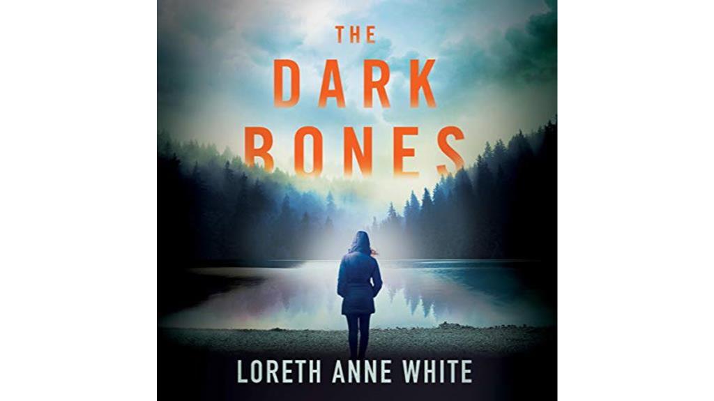
Wander into the intricate world of 'The Dark Bones' and discover a web of suspense that challenges perceptions, igniting a curiosity that begs to be satisfied.
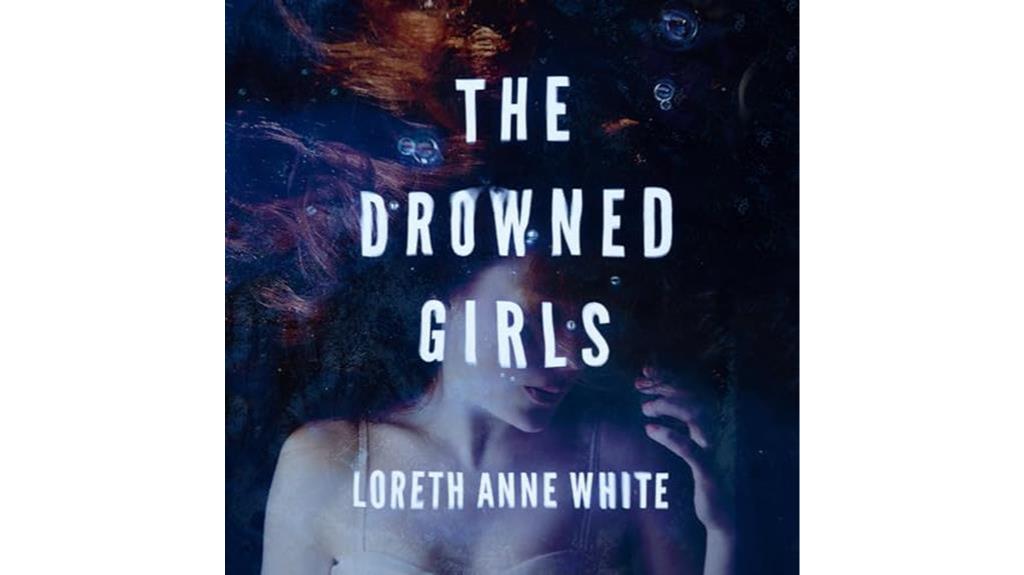
Plunge into the mesmerizing depths of Julie McKay's narration in 'The Drowned Girls' audiobook, where every word pulls you deeper into a world of suspense and darkness.
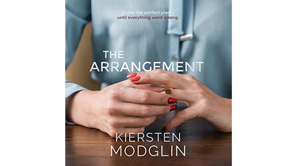
Wander through the intricate web of twists in 'The Arrangement Review,' where suspense beckons and secrets unravel with each turn, leaving you craving more.
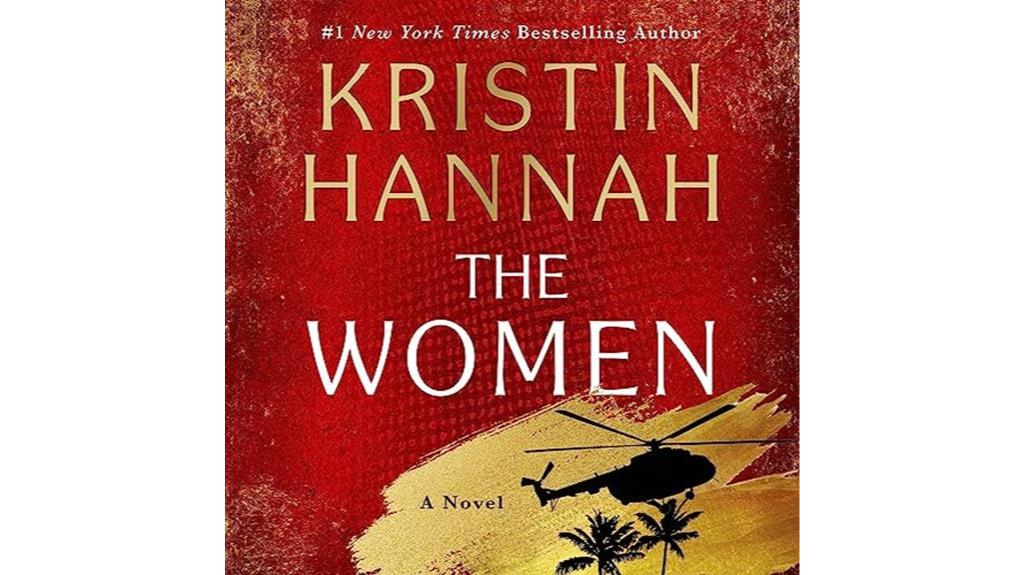
Kaleidoscope of emotions unravel as 'The Women: A Novel' by Kristin Hannah delves into the profound struggles of a nurse during the Vietnam War.
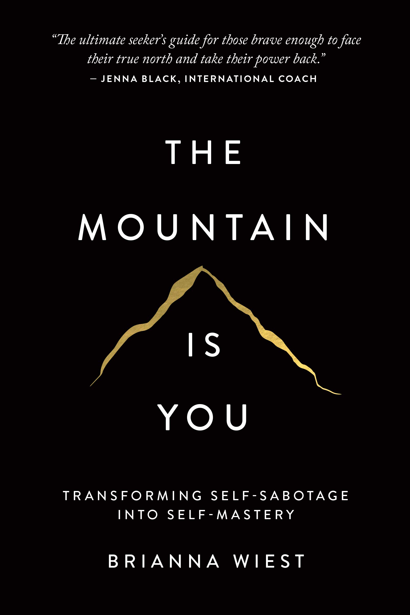
Challenging societal norms, 'The Mountain Is You' audiobook navigates self-sabotage to self-mastery with unexpected twists and relatable characters – a journey worth exploring.
So, I recently finished The Heaven & Earth Grocery Store: A Novel and I couldn’t wait to share my thoughts with you. This book is an absolute gem, and I think it’s worth diving into the details before you decide whether to read it or not. I’ve got the inside scoop for you, so let’s…
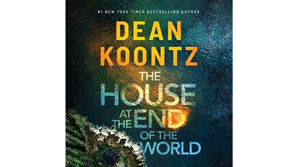
So, I recently got the chance to listen to the Audible book The House at the End of the World by Dean Koontz and let me tell you, it was quite an experience. The story is a fast-paced thriller that keeps you on the edge of your seat, and the characters are so well-developed that…
The book cover for “A Tale of Two Cities” is carefully examined, taking into account a number of important graphic design components. The color scheme is essential for expressing the story’s theme and emotion. The cover usually reflects the historical context of the work during the French Revolution by combining dark colors like deep blues,…
The “Star Wars: A New Hope” movie poster is a classic example of graphic design that successfully conveys the spirit of the picture while grabbing viewers’ attention with its striking visuals. Here is a detailed examination of its several facets: The poster mostly uses a striking combination of black, white, and several tones of blue…